Before we start delving into the world of user-interactive tech (i.e. mobile and web interface), we first need to establish what both are. Here’s a brief recap:
Web Interface: | Mobile Interface: |
The interaction between a user and software running on a Web server. The user interface is the Web browser and the Web page it downloaded and rendered. Source | The graphical and usually touch-sensitive display on a mobile device, such as a smartphone or tablet, allows the user to interact with the device’s apps, features, content, and functions. Source |
Having an excellent UI experience involves more than simply including the basics. Although standard UI patterns are familiar to the eye and are incorporated by many titans in the web world, there are plenty of ways to make them unique to your brand.
This collection of awesome mobile and web interface examples is designed to ignite your inspiration. Based on standard UI patterns (the typical stuff that we deal with every day while surfing the web, through desktop or mobile), these examples include elements of design that have been under-utilized for far too long: illustration.
Though flat illustrations still prevail in many mobile and web interfaces, there is a growing trend for 3D. Creating 3D illustrations in the past used to be a costly thing, done mainly to order, or by in-house 3D artists. Now, more and more stock photo services are offering various 3D illustrations to spice up your interface – at affordable prices!
Flat Illustration vs 3D Illustration
Generally, graphic stocks offer a wider range of flat vector illustrations. This means if you wanted to quickly jazz up your design, you would be able to find a flat illustration in no time at all. Plus, if an illustration is in an SVG file, it will be easily editable/scalable – changing colors to fit in with your interface or company colors. Online services, like Icons8, offer create-your-own flat illustrations, with the ability to use high-quality, pre-made elements.
With 3D images, you have less flexibility. You cannot endlessly resize or edit them like vectors, though some stocks provide illustrations in various sizes and with mask files that let you tweak the colors. That being said, 3D illustrations are the latest new trend, so incorporating them into your interface will ensure you’re standing out from the crowd.
To summarise, illustrations help designers enhance the UX of their mobile and web interface in many different ways. Let’s take a closer look at our collection, and see how illustrations can benefit your UI in more ways than one…
10 Mobile & Web Interface Examples
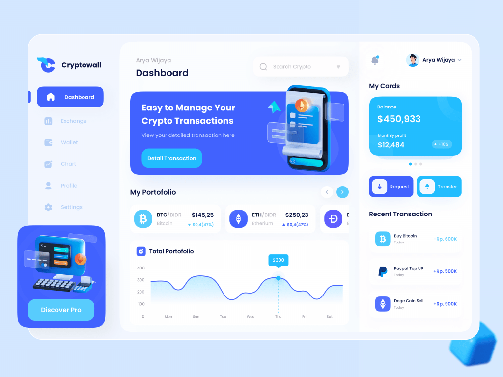
The first and the most obvious reason for using illustrations is making interfaces more visually appealing and memorable. Take this design by Qubstudio, for example, which brings focus to elements with strategically placed images and icons.
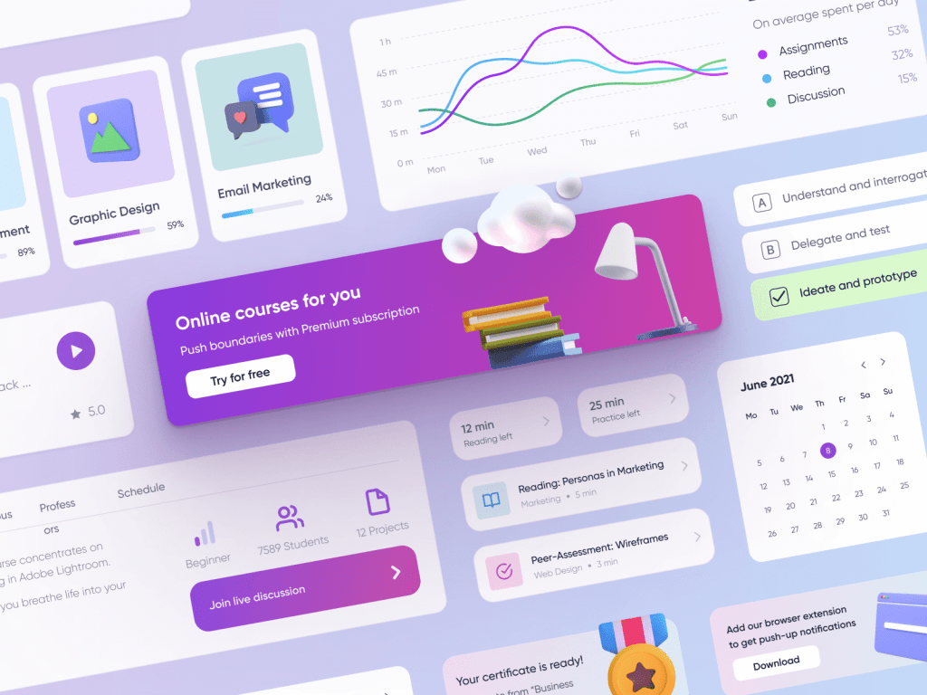
Or this one, by Plainthing Studio.
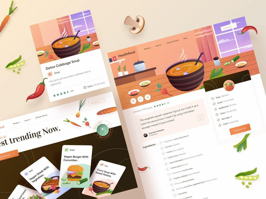
Another reason to use illustrations in your UI, is to create a certain mood or atmosphere – like in the healthy food website concept, by Orely, below.
Next, we get to brand identity – how do you represent your brand within your UI? Simple. Make sure your mobile or web interface design reflects your company style guides (i.e. company colors, fonts, etc). Here’s a great example by Trevor Nielsen.
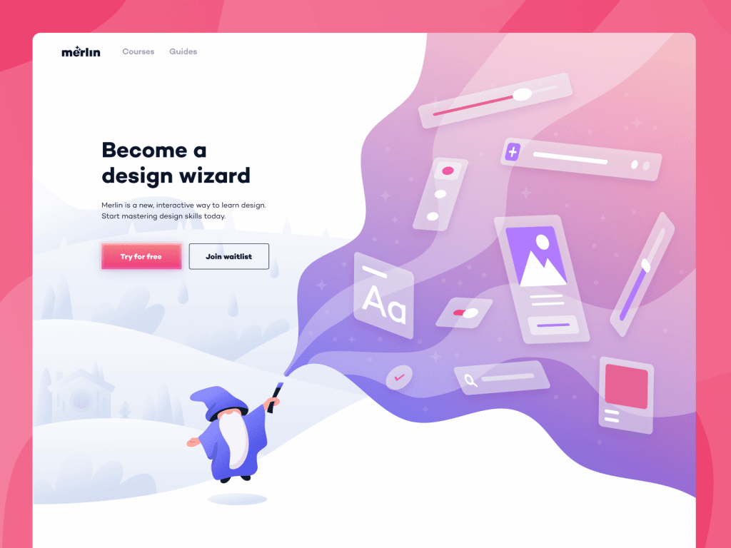
Or – use illustrations themselves as the tagline! See example by Papperpillar.
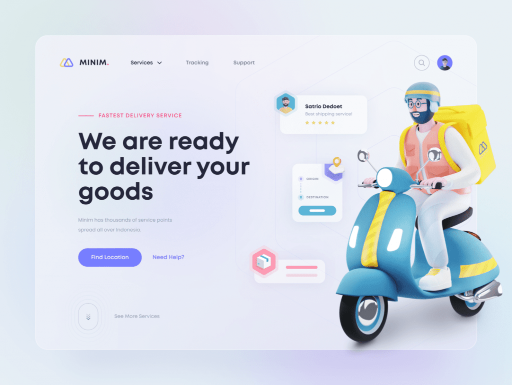
The following example truly demonstrates the potential illustration has on a modern interface. Note how the bright 3D image in the midst of a flat and neutral interface catches your eye and highlights the important things. This clever design was created by Al Nadir, with illustration by Icons8.
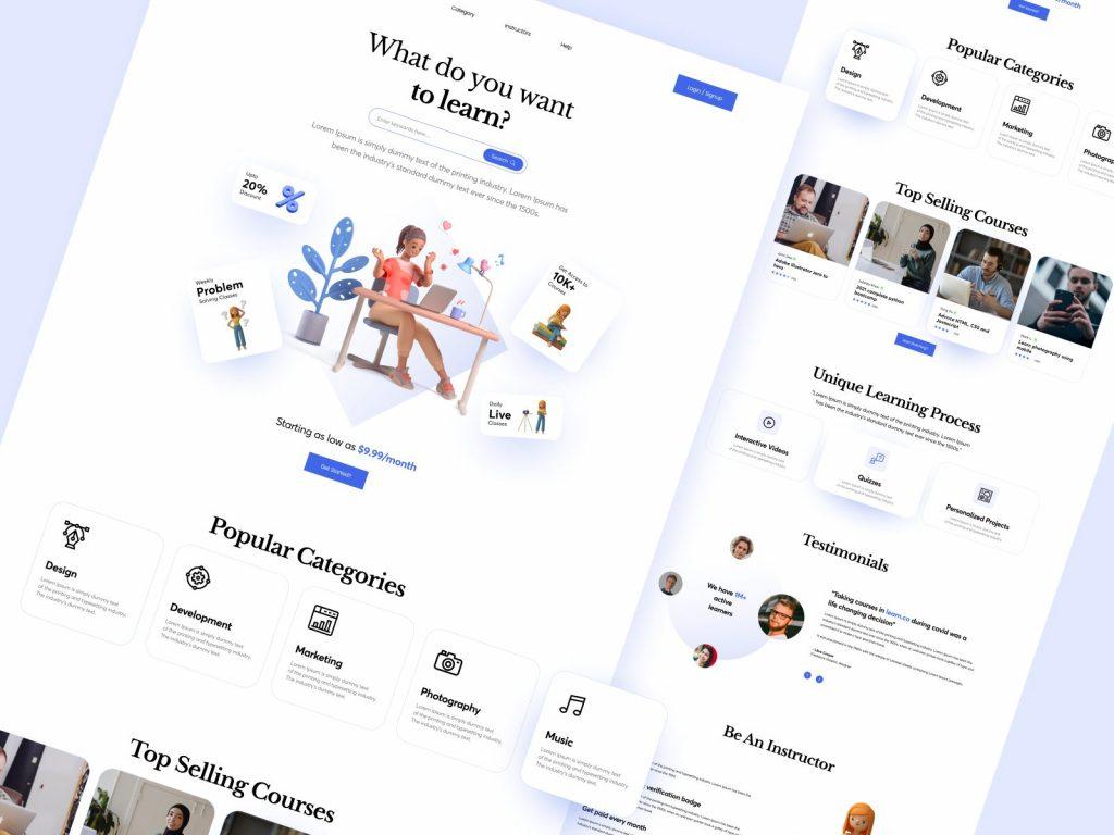
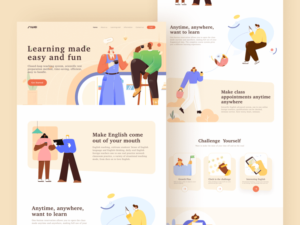
And the great thing about illustrations is how free and creative you can be! Unlock your inner child, like this next designer, RaDesign. This UI example looks something akin to a children’s book – complete with bright pictures that tell users the story behind the product.
Visually attractive 3D characters can also be a useful tactic at engaging users, see Icons8 (1) and One Week Wonders (2).
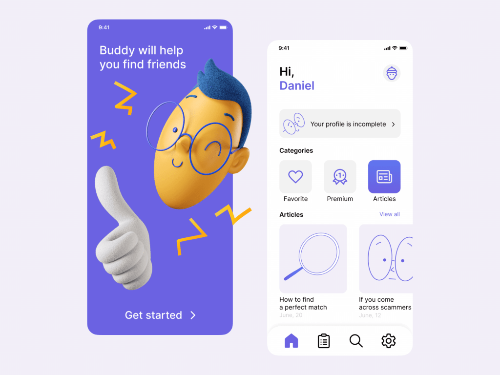
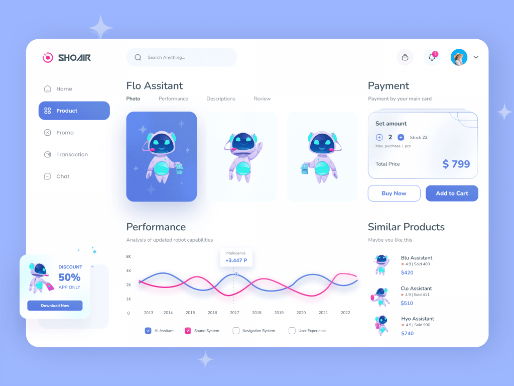
Finally, did we mention how fun illustrations are? No matter the message – whether serious, complex, or too stale for plain old text – you can get your point across with a clever illustration.
The designer of this UI interface (Oliver Odgaard) sure knows how to lighten a day:
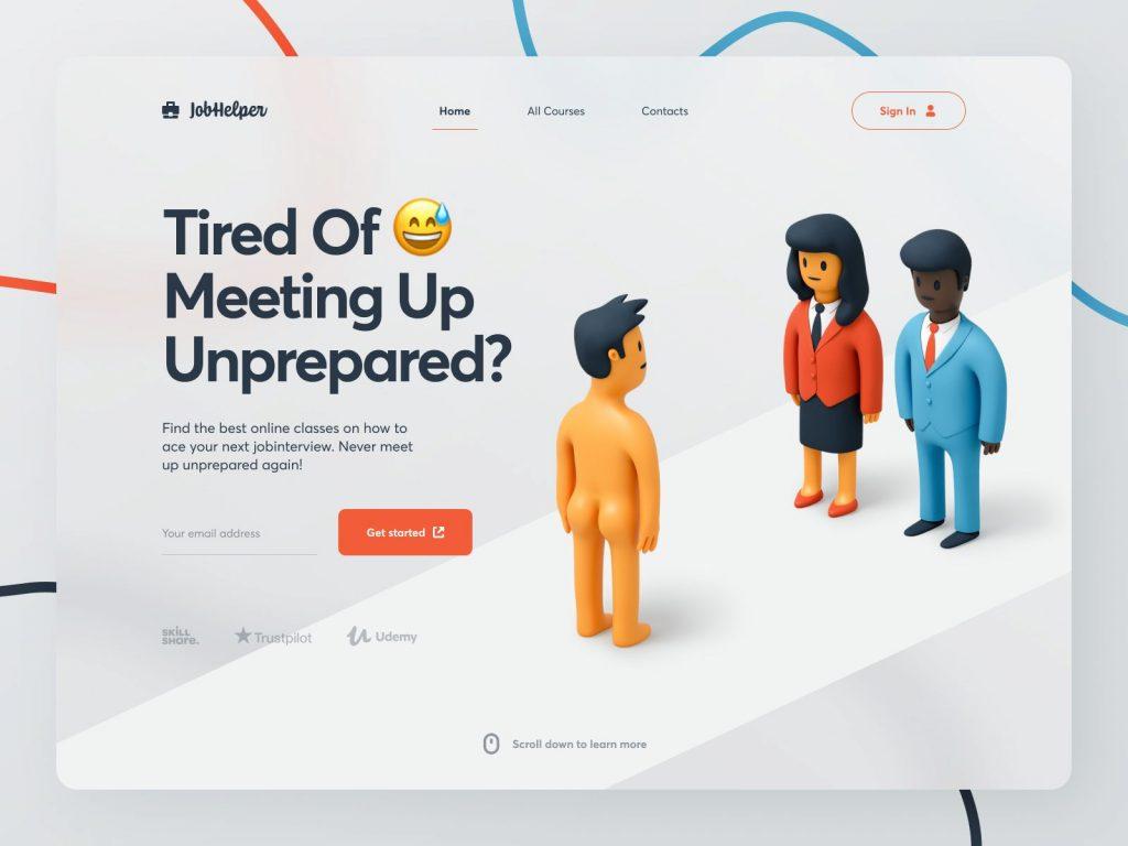
As you can see, your UI mobile or web interface doesn’t need to be boring. Although traditional and simple interfaces are familiar, you’re at risk of putting your users to sleep. Don’t do it! Incorporating illustrations – whether flat or 3D – is an awesome way of modernizing your web experience, and allowing your brand to stand out from competion.
We hope that this collection will inspire you in your upcoming new projects. Why not check out Ouch!, a stock of free illustrations by top artists?
Ready to get hired? At Twine, we have dozens of top-quality jobs being posted each and every day. From design to marketing, development to copywriting – there’s a job ready for your skills. Join the marketplace of creative talent here.


