You may think that there are no set rules to follow when it comes to design, and illustration… and you’d be right! Except, it’s important you’re aware of the very many style shifts and illustration trends.
Whether you’re producing an email, a social post, or a full-fledged ad campaign, one of the most important considerations in your creative development is standing out.
One way to do that is to center your concept on illustration instead of photography. But using just any illustration for your project isn’t enough to catch eyes—one of the best ways to set yourself apart in an otherwise saturated market is to harness burgeoning trends that illustrators are putting their personal spin on. Trends that are both fresh and energetic.
At iStock we receive new, on-trend illustrations every day from a huge roster of regular contributors.
To help bring some of these illustration trends to light, we sat down with Jennifer Borton, the Senior Manager of Illustration contributors at iStock, and got her thoughts on the major themes she’s been seeing the past few months—all so you can use them to better speak to your audience with your projects.
“There are so many topics that are over-saturated—things like website icons or UX imagery,” says Borton. “As an illustration contributor, you want to be refreshing those concepts regularly… trying different color palates, different ways of shading.”
But what exactly are those new takes on tired concepts? What are the new illustration trends that Borton sees from our contributors?
80s-esque, new wave color palettes

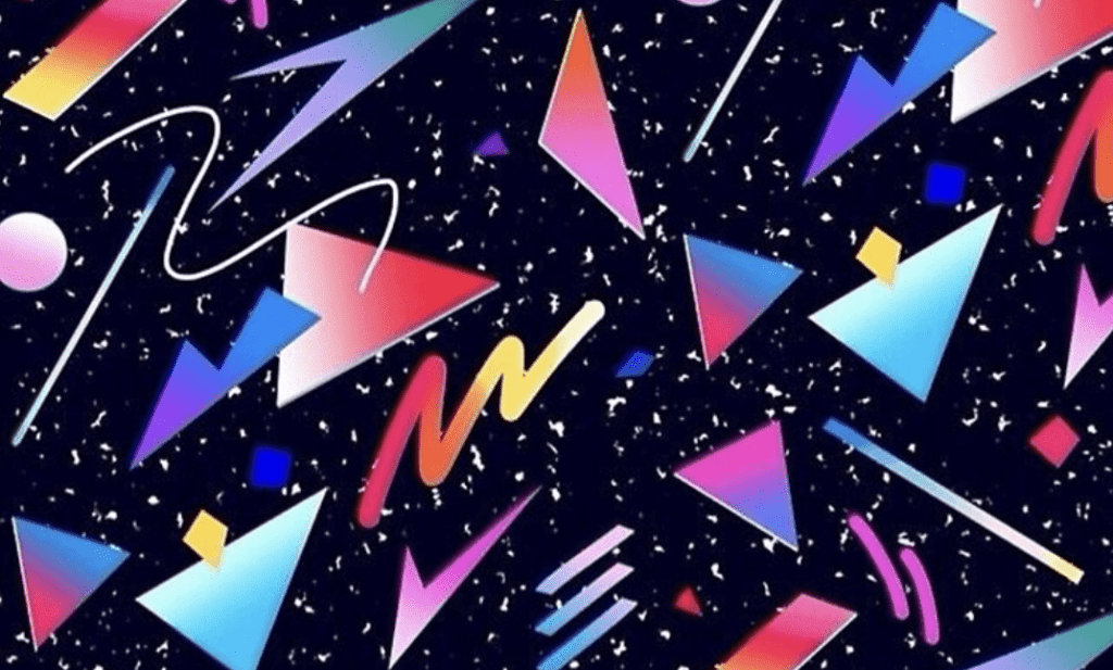
After taking stock of our recent submissions (and what we’re seeing around the marketing world), it’s clear that there’s a heavy emphasis on 80s-leaning color palettes—a scheme Borton calls New Wave.
“Think of the movie Tron, with glowing geometric shapes… really dark saturated purple, with hot pinks, bright oranges, and bright yellows,” says Borton, “we’re seeing it everywhere.”
It’s an emphasis that seems rooted in nostalgia. Even if you think your clients want to appear youthful, these colors—though they hearken back to the ‘80s—allow the current generation of young designers to coopt the sensibilities of their parents, who were most likely ‘80s kids. It may feel retro at first, but it’s actually really fresh.
But it isn’t just nostalgia; there’s cheerfulness and energy associated with these colors that could be particularly powerful when trying to add volume and personality to your projects.
“There’s definitely a sense of optimism… it’s hard to take these colors particularly seriously,” says Borton, “they’re not stuffy. They’re bold.”
Surreal and folk figures

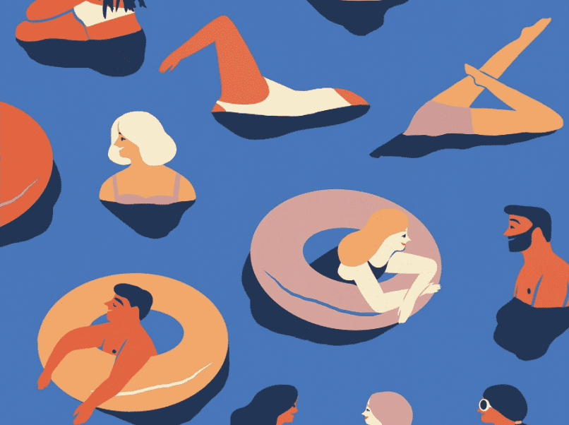
Seemingly on the opposite end of the spectrum from the ‘80s New Wave, the creative market seems to be trending toward folksy human figures with whacky proportions. Borton calls them “rubbery little people without much detail, noodle-y arms, and a folk-art sensibility.”
This is a far cry from the eccentric color scheme from above but seems to serve some of the same purposes for a project. Because the figures seem whimsical, almost cute, it can really help to add a more hands-on, down-to-earth vibe to your project.
Loose illustration techniques like these can work very well paired with photography – particularly if you’re going for a collage-esque vibe, or some kind of editorial, photo-booth montage.
Realistic, not-so-flat shading

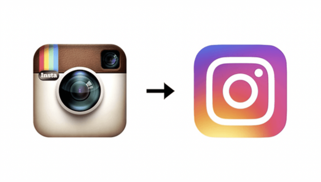
“We’re also seeing a big trend right now moving away from flat design in app-logos,” says Borton, “for many years, there was a style called ‘flat design,’ which was a reaction to the glassy, 3D icons of the first-generation iPhone. But now, after flat design helped to refresh that style, we’re seeing some more shading and more detail creep back in.”
Think about the Instagram logo: up until a few years ago, it was very rounded and textured, but now it’s flat with a really vibrant color scheme (oddly, it’s almost exactly the same as the colors of the New Wave trend from above).
Now, our contributors are starting to add some of those realistic, 3D details back in. “It’s funny to see how cyclical this all can be,” says Borton.
Isometric imagery for infographics
The last trend is one aimed at making data, technology, and otherwise stuffy subjects more interesting and palatable.
We’re seeing an isometric style takeover infographic-type projects to give an accessible, almost childlike feel to complicated topics. “Historically, the isometric style was seen in tearaway drawings of, say, a car engine exploded out,” says Borton, “illustrators have taken that concept and ‘cutened’ it up a bit. I don’t know about you, but I’d rather see an infographic with a bunch of interesting objects and isometrics floating around than, say, a spreadsheet.”
Cheers to that!
Want to explore the whole iStock illustration library? Check it out here. You can also save 10% on all credit packs by applying ISTOCK10 at the checkout.
We hope you enjoyed our article on the very many illustrative methods of the 21st-century! If you’re looking for a high-quality illustrator, you can browse Twine‘s range of talent, right here.
Ready to hire? Our marketplace of over 410,000 freelancers has the skills and expertise needed to skyrocket your business to the next level. From marketers to designers, copywriters to SEO experts – browse the talented bunch here!


