Tradtional Editorial Design vs. Digital Editorial Design
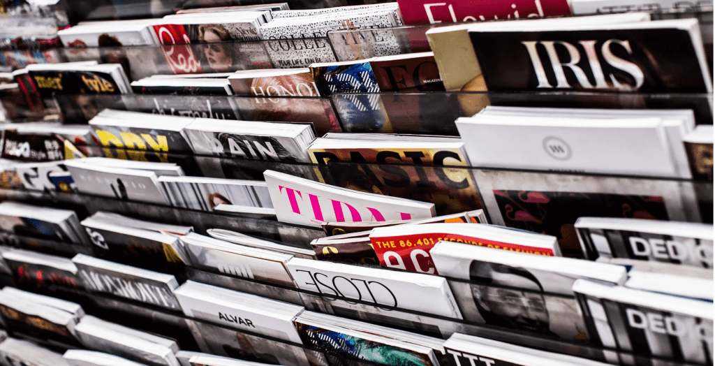
Traditional Editorial Design is the part of Graphic Design that deals with publications: things like books, magazines, zines, and newspapers. Editorial Design has always been known to be stylish, and classic – being brought to fame with its use in fashion publications. Although still popular in some fields today, it’s a dying breed.
So, who’s the successor?
Digital Editorial Design. As a subset of the discipline – Digital Editorial Design deals specifically with electronic media. Electronically-published content is viewed, and absorbed, in a completely different way from traditionally-printed media, allowing greater reach and quicker conversions.
With people doing everything from reading and writing, to Christmas shopping and streaming films, on their devices, the demand and market for digital publications are bigger than ever.
In order to not sink, you must swim. But, with so many sites competing for viewers’ attention – an attention span that has shrunk by 25% in just a few years – it can be hard for a beginner to break in.
As a creator, you need to understand what makes people want to check out your content. And luckily for you – we have the knowledge you need! Read on to learn the basics of Digital Editorial Design…
Hey! Are you after a graphic designer who can help you with your Editorial Design? Look no further…
A Brave New World
It’s hard to believe that a mere 15 years ago, there were no iPhones or Kindles.
Before laptops and internet providers, only the incredibly privileged (read, incredibly wealthy) had a chance at sharing their thoughts and services. Very few people had any idea what the future would hold with regard to digital media.
In fact, it is no understatement to say that the internet and mobile devices have turned traditional publishing models on their heads. Free and inexpensive online publishing tools have virtually eliminated the gatekeepers to the industry. Anyone wishing to share their thoughts can do.
In an astonishingly short amount of time, indie publishing has exploded – over one-third of all English-language e-book sales are accounted for by indie publishing.
As for blogs, there are some 600 million and counting. If you’ve uploaded a story onto the web or keep a blog, you are a publisher – even if you aren’t a digital editor yet.
If you don’t feel confident about your ability to design, and don’t feel ready to hire a designer to help, you can learn the basics of effective editorial design right here!
Make your publication look more appealing and professional by following the laws of editorial design, gaining more readers in the process…
The More Things Change…
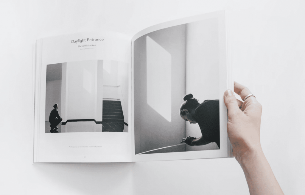
Editorial design plays an essential role in the way information is understood and shared.
Whether you’re promoting a sporting event, or your new range of pearl engagement rings – effectively presented content can transform the very fabric of society. And no matter the medium! Designing for physical print or a digital device, the basic elements of editorial design – including formatting, layout, and artwork – are all similar.
Successful designers know how to integrate these elements in a way that enhances the reader’s experience. Good editorial design is eye-catching but easy to understand. The bad editorial design leaves viewers bored, able to scroll away without giving a second glance. Don’t fall into the trap of bad design!
Consistency Is Key

Consistency is one of the hallmarks of winning digital content.
Creating a successful brand involves making it instantly recognizable, as well as delivering on the promise. By developing an appealing template for your blog – i.e., light background, clean font, lots of images, your readers are will be more engaged.
Honesty is also important. If your blog is all about building birdhouses, you better make sure there’s a birdhouse in every blog thumbnail you have! Likewise, if your blog is about online marketing strategies, skip the post detailing your pet dog’s birthday bash – this probably isn’t what your reader is looking for, no matter how cute the pictures are.
Here’s a tip: give readers what they expect. Every. Single. Time.
Experiment
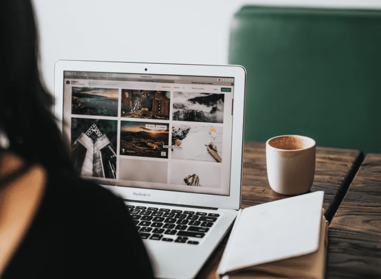
While you do want to give your followers content they can relate to, that doesn’t mean your content and presentation should be predictable to the point of boring. Tastes change and fashion applies to more than just clothes.
Creating fresh looks is one area in which digital editorial design really has an edge over traditional publishing. Most printed media has resisted this change, much to their detriment. While it is important to deliver relevant content, it’s just as important not to get stuck in a rut.
Stay abreast of where trends are heading. Don’t be a slave to them, but do take note of what is catching people’s eye — and what isn’t.
Create a Mood
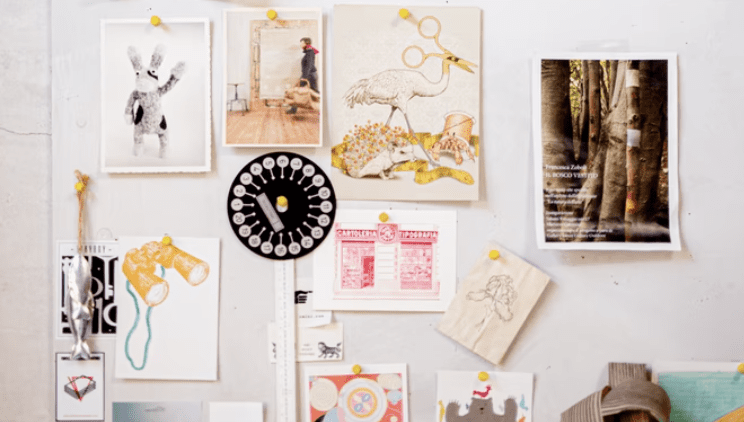
You really can judge a book by its cover — or at least, you should be able to, if the designers have done their job.
Professional designers tend to use mood boards – so, you should too! Mood boards allow you to get your ideas down in one place, and tweak them until you find something that reflects the message you want to convey.
Free and low-cost design services include Canva and Adobe, which allow you to move elements around, try out different text sizes, adjust colors, add special effects, and generally play with all the elements of editorial design.
Check Out the Competition

If you’re just starting out in digital editorial design, one of the best places to start is by checking out e-books, blogs, and digital magazines on topics similar to your own.
You’ll quickly start to note overlaps in the way text is arranged, how color is used, and the placement of graphics. If you don’t, look again, noting which design elements stand out.
Which catch your eye, and which turn you off? What colors are most popular, and which are most appealing to you? Notice font types, and the feelings they convey.
When it comes to layout, digital media is different from print. Large blocks of print aren’t enjoyable to read on a screen. Study your favorite blogs and e-zines, paying close attention to white space. Take notes on how digital editors design pages to break up the written content to give readers’ eyes a rest.
Photos, subheadings, quotes, and graphics are just some of the possibilities for conveying ideas without words, contributing to a quality experience for followers, and increasing engagement.
Digital editorial design has a number of components too. To be successful with online media, it’s important to understand at least a little bit about them. Following are three basic principles to help get you started:
Three Principles of Digital Editorial Design
1. Use a Grid

A grid layout allows you to balance the design, making it appear more organized and coherent. This, in turn, improves readability, understanding, and clarity.
If you’re taking the trouble to communicate with the world, you want to do your best to help people to understand what you’re saying. A basic grid design should have gutters so things don’t look too cramped. Grids themselves are pretty basic and good designers group blocks creatively for maximum impact.
For bloggers, sites like Tumblr and WordPress have a number of professional-looking pre-made templates for you to use. Or, if you’re interested in custom, timeless designs, don’t forget to check out the web design experts.
2. Prioritize
The next important design principle is to make it clear what you want your readers to know.
Digital editorial design is generally produced through typography – font, typeface, size, and color, all help your readers navigate your content. Font and typeface are often used interchangeably, but they are still different.
Fonts, for instance, are types of lettering styles such as Arial or Garamond, while Typeface refers to spacing, serifs, and other graphic elements.
Big letters and bright colors draw the eye, which is why titles are usually the biggest words on the page. Even if your content isn’t an e-book, this is the strategy that you will use to attract attention to the most important part(s) of your post.
The body of the content is usually a simple black print on a white background for easy reading. Note that serifs (those little extra strokes on letters) are easier to read on a printed page than a digital one. Some of the most popular digital fonts are Helvetica, Verdana, and Times because they’re highly readable.
3. Use Graphics
As mentioned above, reading on a screen is different than reading a paper page. Eyes fatigue faster with digital, so help your readers out by not overwhelming them with huge amounts of text. As the saying goes, a picture is worth a thousand words…
The opportunities for incorporating imagery into your digital editorial design are boundless. You can use photos, infographics, charts, illustrations, video clips, and even emojis to get a point across without saying it with words.
Experiment with the placement of your images to determine where they’ll have optimal impact. Remember that everything you include in your content reflects on your brand, so choose your imagery wisely.
Bonus Tip: Be Compatible on Various Platforms
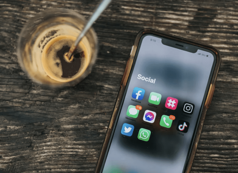
While digital media has been highly disruptive to traditional publishers, it is also infamous for making things harder for itself.
A wide variety of devices, screen sizes, and browsers mean that your content will appear slightly differently on each platform. Smart digital editorial designers make their content usable on both computers and mobile devices, which in turn improves your search rankings.
Check out your content on as many different devices as you can. If you also have a website, it should look good (which is not to say identical) on Google Chrome, Safari, Firefox, UC Browser, and Microsoft Edge. Cross-browser testing is also available for a fee, although many sites offer a free trial of their services.
Conclusion
Good digital editorial design is essential in the internet era.
Quality design enhances readability and clarity and designs must be clean and organized to best convey the message. Grid layouts showcase your content while strong typography captures readers’ attention and helps them navigate through the text. Graphics and images divvy up text blocks and give the eye a break, all while keeping readers engaged.
Good digital editorial designs are accessible regardless of the medium: mobile, desktop, or even old-fashioned print. Keep learning and experimenting, and before you know it, you won’t be a beginner anymore!
Ready to hire? Our marketplace of over 410,000 freelancers has the skills and expertise needed to skyrocket your business to the next level. From marketers to designers, copywriters to SEO experts – browse the talented bunch here!

