As consumers become pickier about the types of digital products they use, graphic designers find themselves facing more significant challenges with graphic styles than ever before. It doesn’t matter whether you’re an artist or a business owner. One thing’s for sure:
For a design to be truly succeed at its purpose, it must be perfectly executed.
We now know how aesthetic appearance impacts first impressions, buyer trust, and even sales. However, the mind-boggling thing is that there’s no set formula to make a design choice work.
Instead, artists and marketers must collaborate to find the best possible decisions regarding a brand’s visual identity, basing their choices on data, consumer research, and personal affinity. But if graphic design is so tricky to get right, what actionable steps are there for designers to take to ensure the best possible results?
One possible answer to this question may be to learn the most important trends and the elements that make sites successful. After all, the internet is starting to look very much alike due to measurable consumer preferences.
So why not combine those preferences with artistic freedom and do something extraordinary?
Are you looking to boost your brand’s performance? Want to improve the chances of your designs getting the right results? If so, here 6 graphic designs & graphic styles that deserve your attention.

1. Bauhaus
If we look at contemporary art, it’s impossible to overlook the impact of the Bauhaus movement.
Founded in 1919 in Germany, the movement was centered around the Staatliches Bauhaus art school, which brought together aesthetics and functionality.
As the originator of the philosophy that form should follow function, it strove to bring together designs, craftsmanship, and innovation, ultimately creating a direction that would forever mark the future.
The Bauhaus design is one of the more easily recognizable graphic styles. On the whole, it is:
- simplistic
- uses grid organization
- employs uncomplicated geometric shapes
- employs visual hierarchy
- uses contrasting colors
Another impactful effect of the Bauhaus movement was that it emphasized the importance of typography in graphic design.
Relying on sans serif fonts, the artists originated several fonts still in use today. And if you’d like to add a Bauhaus-inspired look to your work, you can even download some of the original typography from Adobe.
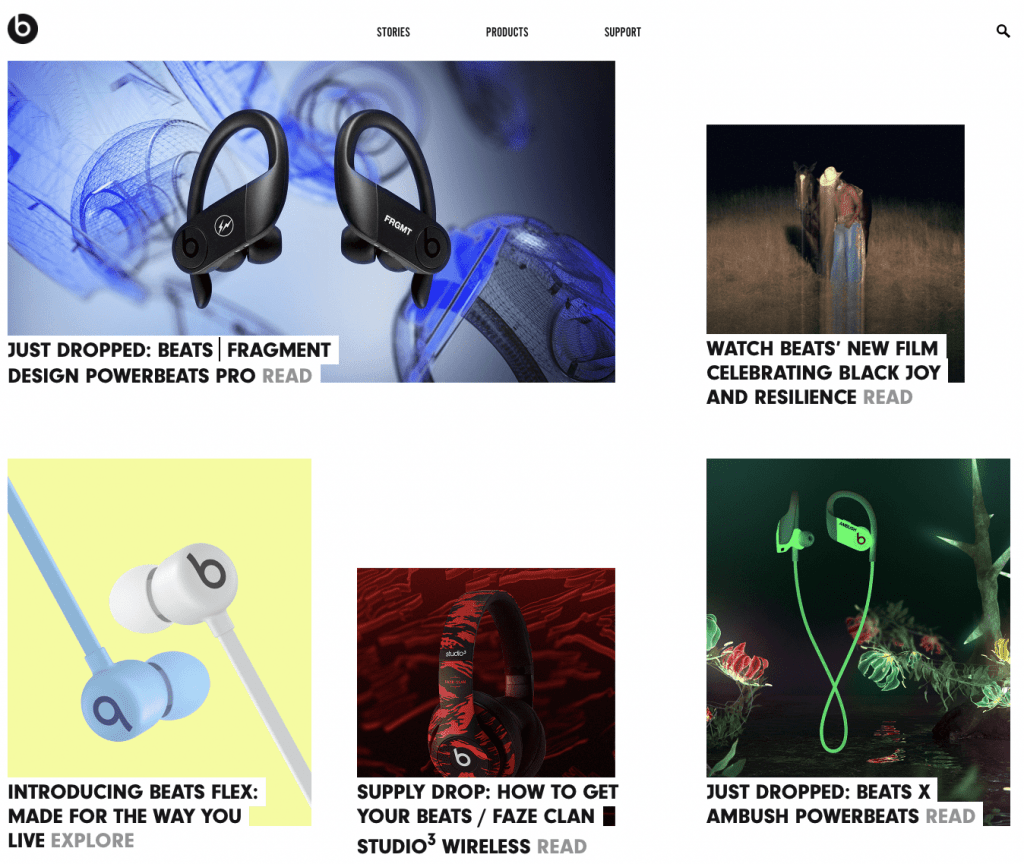
Along with the Dutch De Stijl and the Swiss International graphic style developed in the 1950s, Bauhaus still influences contemporary design. A famous example of a brand that clearly borrowed from the movement is Beats, with its recognizable logo and website that uses an asymmetric grid.
2. Flat 2.0
Although the graphic design world lauds the concepts of simplicity and minimalism (more on which later), a purely geometric design rarely satisfies.
Flat design was first introduced in a digital setting in the early 2000s by Microsoft. Making the basis of the Metro design language used in Windows 8 and influencing Apple’s iOS7, by the mid-2010s, it became the norm in digital settings.
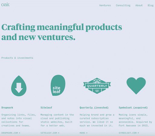
Adopted by brands from all over, it found its way into all spheres of graphic design, even making the style-of-choice for numerous websites:
Still, its core issues remained.
As an aesthetic direction that was simplified to the maximum, it lacked depth, character, and, most importantly, usability.
However, it all changed with Google’s Material Design language. A slight update that sought to add depth to the two-dimensional design, Material Design, or Flat 2.0 rapidly became preferred of all the graphic styles.
These days, it makes the basis of many breath-taking design solutions. From websites to apps to graphics, it’s a popular style that, once again, puts usability over aesthetics.
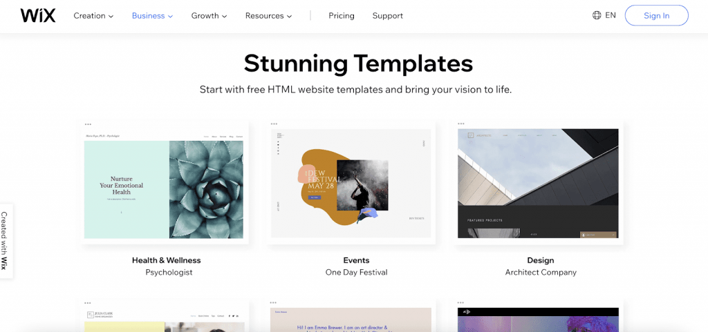
Best of all, it doesn’t rely on flashy effects. Instead, it utilizes subtle visual cues to boost UX, like in the example below from Wix. It is for this reason exactly why you should keep it in mind for your next project.
3. Minimalism
An idea gaining popularity both in people’s aesthetic preferences and lifestyle choices, minimalism is a graphic design style any professional needs to know about.
However, seeing how widespread it is, there’s no need to go into a detailed description of what it is. Instead, the side of minimalism that’s worth exploring to elevate graphic design is the one that’s commonly overlooked.
Unfortunately, the idea of simplicity is so commonly taken to the extreme that the final products often end up being unusable.
Moreover, novice artists tend to think that minimalistic designs have to be monochromatic with LOTS of white.
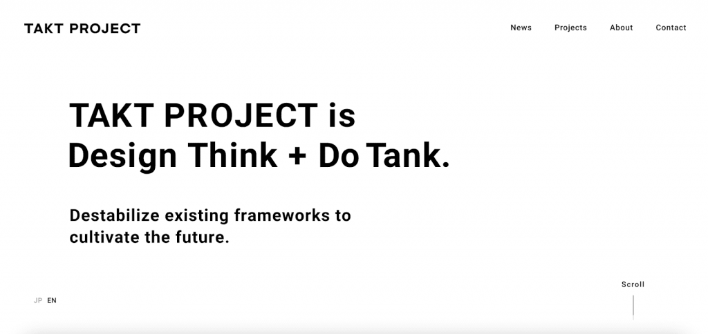
Take, for example, this online presentation by Takt Project. Although minimal at its core and stylized to achieve the desired effect, the design itself is practically inapplicable in almost any other setting.
An eCommerce store requires clearer CTAs, a resources page would need to display assets more visibly, and any type of advertisement would need a much clearer message to be compelling.
So how can graphic designers use minimalism in a way that works for a contemporary digital setting?
Well, one option would be to follow the principles, not the aesthetics. By removing unnecessary or distracting elements, artists can direct attention to exactly where it’s needed.
The GILI Sports website, for example, looks anything but minimalistic.

Nonetheless, it clearly borrows from the direction: the background takes up most of the screen, there is very little text, a single CTA button, and a minimalistic navigation menu. All this is rounded off with bold, sans serif typography for a condensed look that communicates a strong message.
4. Data Visualization
Analytical tools are becoming growingly impactful by the day. Nowadays, data serves not just the purpose of driving decisions but supporting sales as well.
With this in mind, it’s high time for graphic designers to become more invested in the varied ways to visualize data.
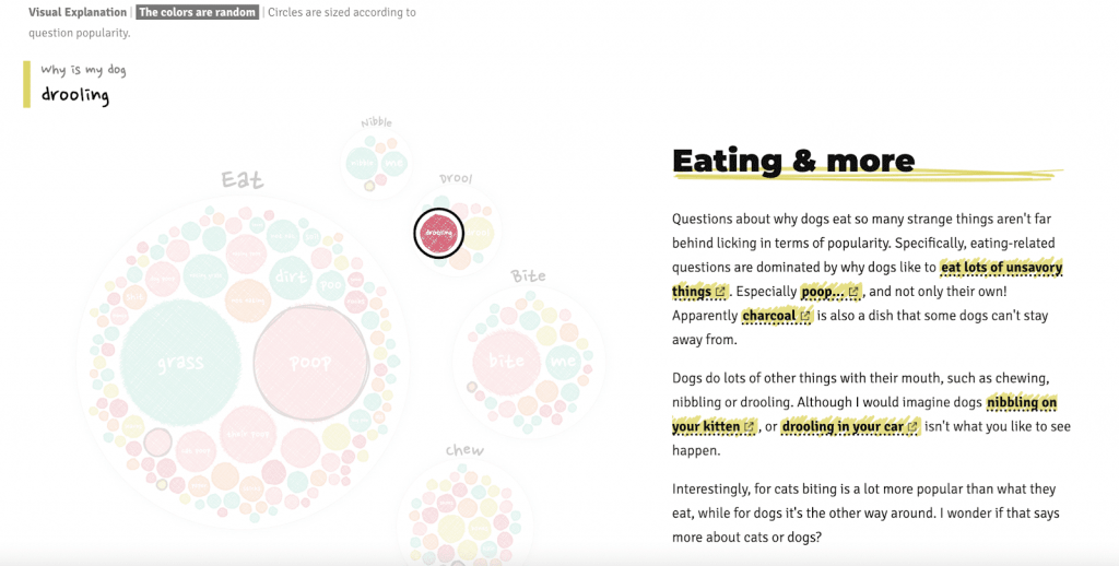
As brands rely on different forms of data to appeal to users, graphic designers must understand the importance of assets like graphs, charts, tables, and diagrams. After all, they’re practically ubiquitous in B2B operations, as well as the SaaS industry.
But the thing is, the way facts and figures are represented cannot rely on the aesthetic and functional principles of, say, Art Nouveau.
Conversely, these visuals have to be precise, accessible, and well-thought-out to appeal to the right audience.
With this in mind, it’s highly recommended that brands have pre-made data visualization guidelines in place. By practicing consistency in this regard, graphic designers can achieve a more unified effect with their creations and produce content that serves its purpose with style.
Best of all, being familiar with the rules and practices of displaying statistics, artists can find original and creative ways to represent otherwise monotonous information.
5. Futuristic
In today’s fast-paced society, artists often stand at the front lines of innovation. Time and again, experience has shown that where designers lead, inventors will follow.
With this in mind, it comes as no surprise that futuristic design is one of the graphic styles that everyone should be familiar with.
Drawing origins from early 20th-century Futurism, the futuristic design style has gone from depicting movement and dynamism to drawing visions of technological progress.

From Nike’s self-lacing shoes to Tesla’s Cybertruck to space-inspired websites and software, the futuristic graphic style plays a crucial role in the aesthetic development of 21st-century products. And, as it’s a direction that always looks towards the future, it will continue to remain relevant for years to come.


6. Illustration, 3D & Animation
But what about concepts or products that are a bit more difficult to depict realistically or in engaging ways? While some may see this as an obstacle, graphic designers thrive in such situations.
Representing concepts that are either abstract or complicated can be a fun challenge. And often, it’s solved by turning towards the illustration, 3D, or animation design styles.
The oldest of these is, of course, illustration. A widely-used narrative technique that’s been around for millennia, it has made its way from cave walls to print to digital screens.
Nowadays, it’s an ever-present tool in the graphic designer’s toolbox, with uses in anything from logo-making to pictographic representations on websites and apps.

But, as technology progressed, so did the pictures people consumed. Artists found that, by putting together static images and having them appear as if moving, they could hold people’s attention. And the new method proved to be far better than just using pictures or drawings.
Of course, while animation represents just one of the successors of illustration, it’s not the only one.
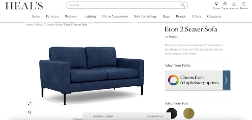
The 3D style also saw its rise in the 20th century, going from a novel effect to a direction profoundly impacting today’s reality. With ultra-capable devices, people consume 3D graphic design daily.
It’s found in anything, from video games to films to 360 views when shopping online. And, It’s even applied in architectural planning and medicine.
Wrapping Up
Of course, the graphic styles mentioned in this guide aren’t the only ones out there. After all, with dozens of artistic directions, it would be quite the task to explain each and every one of them.
Nonetheless, if you’re a hopeful designer, design agency, or business owner looking for inspiration for their visual branding, these six graphic styles are well-worth checking out.
Even if you don’t apply them in their purest forms, they’re almost sure to make an impact on your aesthetic choices. Knowing where they started and what they can offer will help you make a well-informed decision that’s just right for your needs.


